With the Curves Adjustment you will begin learning how to manually adjust your images. In the previous tutorial we showed you how you can use the auto enhance features in Photoshop which does a good job. Once you learn how to use the Curves adjustment, you will see excellent results in enhancing your images. Throughout this course you will learn how to read the curve chart or even how to sample colors using the Eye Droppers. Finally, throughout this tutorial we will be giving you some tips and tricks about Curves!
Currently we are using Windows Vista Home Premium 64 Bit and the Photoshop CS4 Extended 64 Bit version.
Knowledge You Need to Know:
If you are unfamiliar with certain areas that are not covered in this tutorial, feel free check out other tutorials on our website. We have many different types of tutorials that can be downloaded (Video, PDF) or viewed online that will train you for free! Once you have the knowledge, feel free to come back and go through this tutorial again.
Preparing For This Tutorial:
You will be using the ducks image which we have used in the past tutorial. If you do not have this image, please scroll down to the “Click Picture To Download Supporting Files” and download the image. Please open the image PE-DUCKS in the Photoshop Program.
Understanding Curves:
Before we begin, we wanted to talk about what the Curves adjustment will do for you. This nifty tool will enhance you picture. By default you can adjust an image highlights, midtones, and shadows. Or simplistic terms, it can adjust Light areas, Dark Areas and items in between.
Have you ever taken a picture and the colors appear to be washed out or certain areas it is too dark? Well than you will love the Curves adjustment. Besides adjusting all the different colors, the Curves adjustment allows you to change and enhance all colors or only the Reds, Greens and Blues (RGB). For this tutorial we will be working with all the colors at once (RGB) because the steps are exactly the same to fix all 3 primary colors versus the individual primary color. There are different ways to use the Curves and we will show you each way beginning with the easiest method.
Using Curves:
To use the Curves option, Left click the “Image” menu and move your mouse cursor down to the “Adjustments” and a sub-menu will be displayed. Left click the “Curves…” command. Photoshop Tip – The keyboard shortcut is CTRL-“M”.

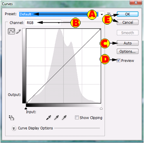
You will than see a dialog box. Let’s go over some basics. The top section is you’re Light area and it is the Highlights of the image. The bottom section is your Dark area or you’re Shadows. The middle area is you’re Midtones. By default Photoshop will create a diagonal line from the bottom left hand corner to the top right hander corner. Bottom left is the darkest portion of the graph and the top right is lightest portion of the graph.

Let’s go over some the basic options.
| A). Left click to see a list of presets you can use. This is explained later in the course. | |
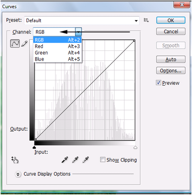
| B). Channel is the Red, Green, Blue. If you select RGB you will change all the colors at once. For this tutorial, please leave it as “RGB”. | |
| C). On this example, Left click the “Auto” button. | |
| D). Make sure the “Preview” option is checked so you can see the changes. | |
| E). Press “OK” if you are happy with the changes or “Cancel” if you want to disregard the changes. |
Because you clicked the “Auto” button, your image should look like this. Wow, a huge difference already.

Eyedropper and Curves:
We are using the “Auto” enhanced image to enhance it even further with the Eye droppers. For all of these eye droppers you will Left click the eye dropper and then Left click that portion of the image. For our example we used the tail of the front duck for the black and the head of the back duck for the gray and the white area of the front ducks tail.
| A). Left click this eye dropper and then Left click the darkest area of the image. | |
| B). Left click this eye dropper and then Left click a gray area of the image. | |
| C). Left click this eye dropper and then Left click a white area of the image. |

On our example we clicked on the back of the front duck to get the black area and for the white area, we clicked on the white tail area of the front duck. Finally for the middle eye dropper we clicked the gray part in the head of the back duck. After clicking the “OK” button, here is our end result.

Using A Preset And Manual Curves:
Let’s get back into the Curves Adjustment and you will notice that every single time you press “OK” it will change the image and that it will always have the diagonal line only. Left click on the Preset drop down menu and Left click the “Medium Contrast (RGB)”.

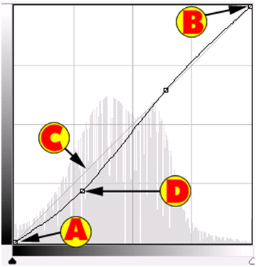
If you look at the chart (also the image will change if you have “Preview” turned on) you will notice it added points to the chart. It is important to understand what these points mean. You always have at least 2 points in the chart.
| A). By default it will add a point in the shadows area (refer to page 4 for more details) which will give you the darkest area of the chart. | |
| B). By default it will add a point in the highlights area (refer to page 4 for more information) which will give you the lightest area of the chart. | |
| C). This is the base line. | |
| D). The additional points are adjustments that it made. |
Understanding Points:
Move your mouse to the center point towards the bottom (the one that we show (D) on from the previous page. Now hold down the Left mouse button and drag that point. You will notice when you drag the point down it will make the image darker and up lighter. See the gray bar on the left hand side of the chart? Notice how it is darker on the bottom? That is why it is getting darker when you move it down.
Maybe you want to change the scale. So the darker is a bit lighter and the lighter is a bit darker. To change the scale, please read the following explanations below.
| A). Move your mouse pointer to the dark up arrow (left hand side). Now hold down the Left mouse button and drag it to the right. Release the Left mouse button when you are complete. | |
| B). Move your mouse pointer to the light up arrow (right hand side). Now hold down the Left mouse button and drag it to the left. Release the mouse button when you are happy with the changes. |

Adding Points:
The easiest way to add a point is to Left click on the line! Remember if you add a point to the top of the line of the chart you will be affecting Highlights and the bottom the Shadows. Maybe there is a specific area of the image you want to enhance. On this example, let’s find an area to enhance the midtones!
On the bottom left hand side of the Curves Adjustment dialog box, Left click the Finger (has an up and down arrow). Now move your mouse cursor to the image and towards the gray part of the back ducks head.
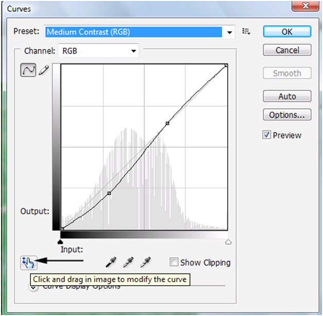
You will notice as you move your mouse over the image an empty circle will move in the Curves Adjustment dialog box. Left click the image area you want and you will notice it will add a point to the chart. Your point may be in a different location than ours, but it should be towards the middle of the chart.

We dragged that new point down and to the right to enhance the image even further. Left click the “OK” button to apply the changes. Photoshop Tip – To delete a point (you must have at least 2 points), Left click the point and press the “Delete” key on the keyboard. You can also drag that point off the chart to delete the point.

Before And After:
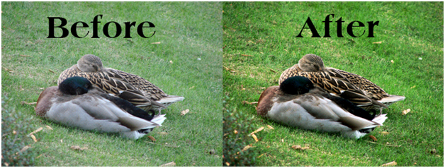
The after image below does not look perfect, but looks a lot better than the original. In the next few sections of this tutorial, we will show you how you can enhance it even further. You will notice the “After” image looks no longer washed out. In our eyes it is an extreme improvement, but not perfect.
Fine Tuning:
The next few sections, we will be discussing how to fine tune this image. Go ahead and bring up the Curves Adjustment dialog box again. Notice how there is 16 gray boxes on the chart? Sometimes it is much easier to fine tune smaller areas. To add smaller gray boxes (this helps you focus on a specific area), hold down the ALT key on the keyboard and Left click on the chart anywhere. Release the ALT key. Now you will see a lot more gray boxes on the chart.

Even though it is the same steps on how you add/change the curves, try enhancing one primary color at a time. Do this by Left clicking the Channel drop down and selecting a color. Instead of changing the curve for all the colors you can change a specific color. You will find if you individually enhance the Red, Green, or Blue your image will look better.
Fixing A Portion Of The Image:
We discussed this tip in the “Auto’s” tutorial, but if you want to adjust only a portion of the image, we recommend that you make a selection of the area that you want to fix (you can even copy it to a new layer). On the example below we made a ROUGH selection of the ducks and made the adjustment. This left the grass still washed out.

The NO’S:
If you are looking to enhance an image, than there are some types of curves that you DO NOT want to try or at least try to stay away from.
| A). Try not to make a steep line (up or down) in between the points. This causes extreme contrast to be added. | |
| B). Try not to make a flat line also between the points. This causes a loss in contrast. | |
| C). Do not make your chart look like a roller coaster. It should not be constantly going up and down. |
Additional Tips:
Besides the opposite of the NO’s, there are a few tips that we would like to go over.
| A). Adding more points to the chart will allow you to fine tune your image even more. | |
| B). Compare! Look at the current image and make your changes. Does it look better? If no, undo your changes. | |
| C). Experiment with curves. Each image will be different and there is not one curve that is right for every picture. | |
| D). Try making an “S” curve. What is an “S” curve? It looks like an “S” on the chart. | |
| E). Adjust each individual color (Red, Green, Blue) separately to get better results. |
Conclusion:
You will notice there are a few options or areas we did not cover, but what you just learned is more than enough for now. When we get into “Levels”, we will be explaining what a Histogram is (that is the gray chart lines in the curves chart).
By now you should know how to adjust all of the colors or just a specific primary color of an image. You have also learned how to use the eye droppers to select your highlights, midtones, and shadows. We also showed you how the “Auto” button does a good job to enhance it very quickly. By now you should know how to read and add/remove points from the chart. We also explained what types of curves you should stay away from! Finally we showed you the presets do a very good job at enhancing an image.
End result, your image should look much better now.

1). How do you remove a point from the Curves chart?
| A). Hold down the Left mouse button and drag it to the “Delete” button on the right hand side. | |
| B). Hold down the Left mouse button and drag it off of the chart. | |
| C). Left click the “Reset” button. | |
| D). You only can press “Cancel” and then add the points again. |
2). What area of the chart is for the Highlights?
| A). Middle. | |
| B). Top. | |
| C). Bottom. | |
| D). Bottom Left. |
3). The Channel is for what in the Curves Adjustment dialog box?
| A). It allows you to switch channels which are layers. | |
| B). You can change the Channel to change the shades of the contrast displayed. | |
| C). Unless you are working on a black and white photo, you can’t change the Channel. | |
| D). Use the Channel option to use the curves on either the Red, Green, Blue or RGB colors. |
4). What sub-menu is the Curves located in?
| A). Image. | |
| B). Curves. | |
| C). Adjustments. | |
| D). Curve Adjustments. |
5). What is the keyboard shortcut to get to the Curves dialog box?
| A). ALT-“C”. | |
| B). CTRL-ALT-“C”. | |
| C). ALT-“A”. | |
| D). CTRL-“M”. |
6). In the Curves Adjustment dialog box, what is one way to quickly enhance your photo?
| A). Left click the “Auto” button. | |
| B). Right click the chart and Left click “Auto Enhancements” command. | |
| C). Move the dark left up arrow on the bottom to the far right. | |
| D). There is no quick way to enhance the photo in Curves. |
7). What does the far left Eye Dropper do in the Curves adjustment dialog box?
| A). It allows you to select a gray area in your photo to sample. | |
| B). It allows you to select a light area in your photo to sample. | |
| C). It allows you to select a midtone area in your photo to sample. | |
| D). It allows you to select a black area in your photo to sample. |
8). The bottom area of the chart is called what?
| A). Highlights. | |
| B). Midtones. | |
| C). Shadows. | |
| D). RGB. |
9). What is the least amount of points you can have in the Curves Adjustment dialog box?
| A) 1. | |
| B). 2. | |
| C). 3. | |
| D). 4. |
10). Name one of the NO’s we recommended that you stay away from if you are trying to enhance an image?
| A). DO NOT adjust each individual color or else it will cause problems (stick with RGB only). | |
| B). DO NOT create a chart that looks like a roller coaster. | |
| C). DO NOT add to many points or it will cause problems with adjustments. | |
| D). DO NOT experiment with curves because truly there are only 1-2 types of curves that improve your image (example: “S” curve). |
Answers: 1). B, 2). B, 3). D, 4). C, 5). D, 6). A, 7). D, 8). C, 9). B, 10). B
Scoring:
0 - 5 = Please review the video tutorial and re-read this document either offline (PDF) or online.
6 – 8 = We would recommend that you print this document off and read it at a later time.
9 – 10 = Congratulations you have passed the quiz. Go ahead and view another tutorial on our site.
We hope you enjoyed this detailed tutorial. Please visit us at: http://www.Photoshopeducation.blogspot.com to expand your knowledge within Adobe Photoshop.

Click Picture To Download Video File To View Offline
Download Total Video Player, iTinySoft

Click Picture To Download PDF Tutorial
Download Adobe Reader, Adobe Corporation
Click Picture To Download Supporting Files
(Brushes, Textures, Fonts, Images, Actions, .PSD, Etc.)
Download ZipGenius Standard Edition 6.0.3.1150, Dicono di ZipGenius


0 comments:
Post a Comment